Color wields a powerful influence on our perception and emotions within interior spaces. In double wide interiors, the strategic use of color can transform the atmosphere and functionality of rooms. The psychology of color in interior design harnesses hues to create specific moods, alter spatial perceptions, and evoke desired emotional responses.
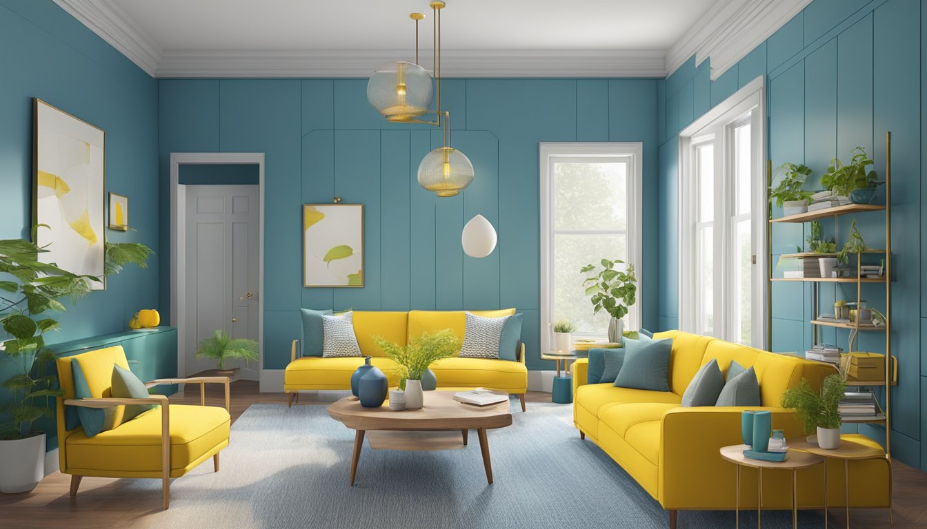
Double wide interiors present unique opportunities for color application due to their expansive layout. Lighter shades can make spaces appear larger and more open, while darker tones add depth and coziness. Cool colors like blues and greens promote relaxation, ideal for bedrooms or living areas. Warm hues such as reds and oranges energize spaces, suitable for kitchens or home offices.
Understanding color psychology allows homeowners to customize their double wide interiors effectively. By selecting colors that align with intended room functions and desired emotional states, residents can create harmonious living spaces. This approach enhances both the aesthetic appeal and practical utility of double wide homes.
Fundamentals of Color Psychology
Color psychology examines how different hues influence human emotions, behaviors, and perceptions. This field combines elements of psychology, design theory, and neuroscience to understand color’s impact on our daily lives and living spaces.
Understanding Color Psychology
Color psychology explores the effects of colors on human emotions and behavior. Different hues can evoke specific feelings and reactions. Red often stimulates energy and excitement, while blue tends to promote calmness and tranquility.
Cultural and personal experiences also shape color associations. In Western cultures, white symbolizes purity, while in some Eastern cultures, it represents mourning. Individual preferences and past experiences further influence color perceptions.
Designers use color psychology to create desired atmospheres in spaces. Warm colors like orange and yellow can make rooms feel cozy and inviting. Cool colors such as green and purple often create a sense of relaxation and serenity.
Emotions and Color Perception
Colors can trigger emotional responses and affect mood. Bright, saturated hues tend to energize and stimulate. Soft, muted tones often have a calming effect.
Here’s a brief overview of common color-emotion associations:
- Red: Excitement, passion, energy
- Blue: Calmness, trust, stability
- Yellow: Happiness, optimism, creativity
- Green: Nature, growth, harmony
- Purple: Luxury, mystery, spirituality
The intensity and shade of a color also impact emotional responses. Light blue may feel soothing, while deep blue can evoke feelings of depth or sadness.
Color combinations further influence perception. Complementary colors create visual interest, while analogous colors promote harmony.
Color Theory Basics
Color theory provides a framework for understanding color relationships and creating effective color schemes. The color wheel is a fundamental tool, illustrating primary, secondary, and tertiary colors.
Key color theory concepts include:
- Hue: The pure color itself
- Chroma: Color intensity or purity
- Saturation: The strength or weakness of a color
- Value: The lightness or darkness of a color
Color harmonies guide the creation of pleasing combinations:
- Monochromatic: Various shades and tints of one color
- Complementary: Colors opposite each other on the color wheel
- Analogous: Colors adjacent on the color wheel
Understanding these principles helps designers create balanced and visually appealing color schemes in double wide interiors.
Influence of Colors on Mood and Behavior

Colors play a significant role in shaping our emotional responses and actions within interior spaces. Different hues can evoke specific feelings and influence our overall well-being.
Impact of Warm Colors
Warm colors like red, orange, and yellow tend to stimulate energy and activity. Red can increase heart rate and create a sense of urgency, making it suitable for social areas. Orange promotes enthusiasm and creativity, often used in workspaces to boost productivity.
Yellow radiates cheerfulness and optimism, ideal for kitchens or dining areas. These colors can make spaces feel more intimate and cozy, perfect for large double-wide interiors.
However, warm colors should be used judiciously. Too much intensity may lead to overstimulation or anxiety in some individuals.
Effectiveness of Cool Colors
Cool colors such as blue, green, and purple have a calming effect on mood and behavior. Blue promotes relaxation and tranquility, making it ideal for bedrooms or bathrooms. It can lower blood pressure and heart rate, reducing stress levels.
Green evokes feelings of balance and harmony, connecting occupants with nature. It’s excellent for living rooms or study areas, enhancing focus and concentration.
Purple, associated with luxury and creativity, works well in accent pieces or meditation spaces. Cool colors can make rooms appear larger, beneficial in smaller areas of double-wide homes.
Neutral Tones and Psychological Balance
Neutral colors like beige, gray, and white create a sense of stability and versatility in interior spaces. They serve as excellent backdrops, allowing other design elements to stand out.
Beige promotes a feeling of warmth without the intensity of warm colors. It’s often used in living areas to create a welcoming atmosphere.
Gray, depending on its shade, can evoke sophistication or calmness. Light grays work well in bedrooms, while darker tones add depth to common areas.
White reflects light, making spaces feel open and clean. It’s frequently used to create a sense of spaciousness in double-wide interiors.
Strategic Color Choices in Interior Design

Color selection plays a crucial role in shaping the atmosphere and functionality of double wide interiors. Thoughtful color choices can enhance spatial perception, evoke specific emotions, and create a cohesive design aesthetic.
Color Schemes for Double Wide Interiors
Double wide interiors benefit from color schemes that create a sense of unity and flow. Monochromatic schemes using various shades of a single color can make spaces feel larger and more cohesive. Analogous color schemes, which use colors adjacent on the color wheel, create a harmonious and relaxing environment.
Complementary color schemes, utilizing colors opposite each other on the color wheel, can add visual interest and energy to specific areas. For example, pairing blue and orange accents in a neutral-toned living room can create focal points and depth.
Split-complementary schemes offer a balanced approach, combining a base color with two adjacent colors of its complement. This versatile option works well in open-concept layouts, allowing for distinct yet coordinated zones within the double wide.
Choosing Colors for Spatial Perception
Color choices significantly impact how spacious or cozy a room feels. Light colors like soft whites, pale blues, and light grays can make rooms appear larger and more open. These hues reflect more light, creating an airy atmosphere ideal for smaller spaces within a double wide.
Darker colors, when used strategically, can add depth and dimension. Deep blues or greens on an accent wall can create a sense of receding space, making a room feel longer. Warm tones like soft yellows or terracottas can make large spaces feel more intimate and inviting.
Using a gradient of colors from light to dark can guide the eye through the space, creating a natural flow between rooms. This technique is particularly effective in open floor plans common in double wide interiors.
Psychological Effects of Color in Textiles and Accessories
Textiles and accessories offer opportunities to incorporate color psychology without committing to permanent changes. Blue textiles can promote relaxation and calmness, making them suitable for bedrooms and bathrooms. Green accents in living areas can foster a sense of balance and harmony with nature.
Yellow accessories in kitchens or dining areas can stimulate appetite and conversation. Red elements, used sparingly, can add energy and excitement to social spaces. Purple textiles can add a touch of luxury and sophistication to bedrooms or formal areas.
Neutral-toned larger pieces paired with colorful accessories allow for easy updates as color preferences change. This approach provides flexibility while maintaining the overall design integrity of the double wide interior.
Creating Atmosphere with Color

Color choices profoundly impact the mood and feel of double wide interiors. Strategic use of hues can transform spaces, evoking specific emotions and setting distinct tones.
Crafting Tranquility and Relaxation
Soft blues and gentle greens promote a sense of calm in bedrooms and living areas. These cool tones lower blood pressure and heart rate, fostering relaxation. Pale lavender adds a touch of serenity, perfect for reading nooks or meditation spaces.
Neutral shades like warm beige or soft gray create a peaceful backdrop. These colors pair well with natural textures, enhancing the tranquil atmosphere. Consider using these hues in larger areas to establish a soothing foundation.
Accent with muted earth tones to ground the space. Soft browns and subtle terracottas add warmth without disturbing the peaceful ambiance.
Stimulating Creativity and Passion
Vibrant colors energize spaces and spark creativity. Yellow infuses rooms with optimism and mental clarity, ideal for home offices or craft areas. Orange promotes enthusiasm and sociability, perfect for playrooms or gathering spaces.
Red, used judiciously, can ignite passion and stimulate conversation. Consider red accents in dining areas to enhance appetite and encourage lively discussions.
Pair bright hues with neutral tones to prevent overstimulation. White or light gray walls allow colorful furniture or artwork to stand out without overwhelming the senses.
Incorporate pops of color through accessories or accent walls. This approach maintains visual interest while allowing for easy updates as tastes change.
Engineering Luxury and Elegance
Deep, rich colors evoke a sense of opulence in double wide interiors. Royal purple adds drama and sophistication to formal living areas or master bedrooms. Navy blue creates a luxurious backdrop for metallic accents and plush textures.
Emerald green pairs beautifully with gold or brass fixtures, elevating the perceived value of a space. Use this combination in bathrooms or dining areas for a touch of glamour.
Charcoal gray serves as a modern neutral, lending depth and refinement to any room. It works well with both cool and warm color palettes, offering versatility in design.
Incorporate high-gloss finishes or metallic elements to enhance the luxury factor. Mirrored surfaces and crystal accents reflect light, adding sparkle and perceived spaciousness to rooms.
Color Selection for Different Room Functions

Choosing the right colors for each room in a double wide can significantly impact mood and functionality. Thoughtful color selection enhances the purpose of each space, creating environments that support relaxation, energy, or productivity.
Relaxing Bedroom Color Palettes
Soft blues and greens promote tranquility in bedrooms. Light shades of lavender or sage green evoke a sense of calm. Neutral tones like warm beige or soft gray create a soothing backdrop.
Pale blue walls paired with white trim foster a peaceful atmosphere. Add depth with darker blue accents in bedding or curtains.
For a nature-inspired palette, combine light green walls with natural wood tones. This combination brings in elements of growth and renewal.
Avoid bright or intense colors that may stimulate rather than relax. Opt for muted shades and tints to create a restful sanctuary.
Energizing Living Room Shades
Warm colors like yellow, orange, and red invigorate living spaces. These hues promote socializing and activity.
A sunny yellow accent wall brightens the room and lifts spirits. Balance with neutral furniture to prevent overstimulation.
Coral or terracotta shades add warmth and encourage conversation. These colors work well in social areas.
For a bold statement, try a deep red accent wall. This creates a focal point and energizes the space.
Cool colors can also enliven a room. Vibrant teals or electric blues add a refreshing pop of color.
Use color sparingly in high-traffic areas. Too much intensity may overwhelm the senses.
Productive Workspace Hues
Green promotes focus and creativity in home offices. Light sage or mint green walls create a calming yet stimulating environment.
Blue enhances concentration and productivity. Pale blue walls with navy accents provide a professional atmosphere.
Warm neutrals like light brown or taupe offer a soothing backdrop for work. These colors reduce eye strain during long hours.
Avoid bright reds or oranges, which may be too stimulating for concentrated work. Instead, use these as small accents.
White walls maximize natural light, crucial for maintaining alertness. Add color through furniture or artwork to prevent a sterile feel.
Consider a feature wall in a subtle pattern or texture. This adds visual interest without distracting from work tasks.
Implementing Color Trends

Color trends in double wide interiors can significantly impact the mood and atmosphere of the living space. Staying current with popular hues while incorporating timeless color strategies creates a balanced and appealing environment.
Staying Current with Color Trends
Color trends in double wide interiors evolve regularly. Neutral tones like warm greys and soft beiges remain popular for their versatility. Bold accent colors such as deep teals and rich ochres add visual interest to spaces.
Earthy tones inspired by nature are gaining traction. Sage greens, terracotta, and muted blues create a calming atmosphere. These hues connect occupants with the outdoors, promoting a sense of well-being.
Designers often incorporate trendy colors through easily changeable elements:
- Throw pillows
- Area rugs
- Wall art
- Curtains or drapes
This approach allows homeowners to update their space without major renovations.
Timeless Color Strategies
While trends come and go, certain color strategies stand the test of time in double wide interiors. Neutral base colors provide a versatile foundation for design schemes. White, cream, and light grey walls create an open, airy feel.
Monochromatic color schemes using varying shades of a single hue create a cohesive look. This approach works well in smaller spaces, making rooms appear larger and more unified.
Color psychology plays a crucial role in timeless design:
- Blue: Calming and serene
- Green: Refreshing and natural
- Yellow: Energizing and cheerful
Combining these principles with current trends results in a balanced, appealing interior that feels both modern and enduring.
Color and Visual Balance
Color selection and placement play crucial roles in achieving visual harmony within double wide interiors. Thoughtful application of color theory principles can create balanced, inviting spaces that feel cohesive and well-proportioned.
Color Wheel Application
The color wheel serves as a valuable tool for selecting harmonious color schemes in double wide interiors. Adjacent colors on the wheel, known as analogous colors, create a sense of unity when used together. For example, combining shades of blue and green can evoke a calming, nature-inspired atmosphere.
Triadic color schemes, using three evenly spaced colors on the wheel, offer visual interest while maintaining balance. This approach works well in open-concept layouts, allowing each area to have its own identity while relating to the whole.
Split-complementary schemes use a base color and two adjacent colors to its complement. This creates a vibrant yet balanced look, ideal for larger spaces that benefit from added visual excitement.
Complementary and Accent Colors
Complementary colors, located opposite each other on the color wheel, create striking contrasts when used together. In double wide interiors, this principle can be applied through accent walls or bold furnishings to add visual interest and depth.
An accent wall in a complementary color can define specific areas within an open floor plan. For instance, a deep blue accent wall in a predominantly warm-toned living area creates a focal point and adds dimension.
Accent colors introduced through accessories, artwork, or textiles offer flexibility in changing the room’s mood. Throw pillows, rugs, or curtains in complementary hues can tie a space together without overwhelming it.
Using the 60-30-10 rule helps maintain balance when incorporating complementary colors. This guideline suggests using the dominant color for 60% of the space, a secondary color for 30%, and an accent color for the remaining 10%.
Psychology of Specific Colors
Colors evoke distinct emotional and psychological responses in interior spaces. Different hues can influence mood, perception, and behavior in unique ways.
Red: Passion and Energy
Red stimulates excitement and energy in double wide interiors. It raises heart rate and blood pressure, creating a sense of urgency and intensity.
In small doses, red adds warmth and drama to a space. It works well as an accent color in living areas or dining rooms to encourage conversation and appetite.
Overuse of red can lead to feelings of aggression or overwhelm. It’s best used sparingly in bedrooms or relaxation spaces.
Blue: Stability and Calm
Blue promotes feelings of tranquility and trust in double wide homes. It lowers blood pressure and heart rate, inducing a sense of peace.
Light blue hues create an airy, expansive feel in small spaces. Darker blues add depth and sophistication to larger rooms.
Blue works well in bedrooms and bathrooms to create a serene atmosphere. It can also boost productivity in home offices or study areas.
Green: Harmony and Growth
Green evokes nature, balance, and renewal in double wide interiors. It reduces eye strain and promotes a sense of well-being.
Sage and olive greens create a cozy, earthy ambiance in living spaces. Brighter greens inject energy and freshness into kitchens or sunrooms.
Green is versatile and pairs well with both warm and cool color schemes. It’s ideal for creating a harmonious flow between indoor and outdoor living areas.
Yellow: Joy and Alertness
Yellow infuses double wide interiors with optimism and mental stimulation. It enhances mood and encourages communication.
Soft yellows create a warm, welcoming atmosphere in entryways or living rooms. Brighter shades energize kitchens and dining areas.
Too much yellow can be overwhelming or cause visual fatigue. Use it as an accent color or in well-lit spaces to maximize its positive effects.
Orange: Creativity and Enthusiasm
Orange combines the energy of red with the cheerfulness of yellow. It stimulates social interaction and boosts creativity in double wide homes.
Terracotta or burnt orange tones add warmth to living areas and bedrooms. Brighter oranges enliven playrooms or home gyms.
Orange can increase appetite, making it suitable for dining areas. Use it judiciously in spaces meant for relaxation, as it can be overstimulating.
Black and White: Contrasts in Emotion
Black and white create stark contrasts in double wide interiors, evoking different emotional responses.
White expands space, promotes cleanliness, and reflects light. It creates a blank canvas for other design elements but can feel cold if overused.
Black adds sophistication and drama. It creates depth and definition in small doses but can make spaces feel smaller and more enclosed when used extensively.
Combining black and white creates a classic, timeless look. This high-contrast palette allows for bold statements and versatile design options in double wide homes.
Practical Tips for Homeowners
Color choices can significantly impact the look and feel of a double wide interior. Selecting the right shades and incorporating them effectively can transform your space.
Choosing the Right Color for Your Space
Consider the purpose and size of each room when selecting colors. Light colors like soft blues, pale greens, and gentle yellows can make smaller spaces feel more open and airy. For larger areas, darker hues like deep blues or rich greens can create a cozy atmosphere.
Neutral tones provide flexibility and timelessness. Beige, gray, and white serve as excellent base colors, allowing for easy updates with accessories and accent pieces.
Think about the mood you want to evoke. Cool tones like blues and purples promote relaxation, while warm tones like reds and oranges energize a space.
Mixing Colors and Patterns
Use the 60-30-10 rule as a guide for color distribution. Apply the dominant color to 60% of the room, a secondary color to 30%, and an accent color to 10%.
Combine patterns thoughtfully. Pair large-scale patterns with smaller ones, and vary the pattern sizes to create visual interest without overwhelming the space.
Incorporate texture to add depth. Mix smooth surfaces with rough textures to enhance the visual appeal of your color scheme.
Incorporating Color through Lighting
Utilize lighting to enhance your chosen color palette. Warm-toned bulbs can intensify warm colors, while cool-toned bulbs complement cooler shades.
Consider dimmer switches to adjust the ambiance. Lower light levels can soften bright colors, while brighter lighting can energize muted tones.
Use accent lighting to highlight specific areas or colors. Focused lights can draw attention to artwork or architectural features, adding depth to your color scheme.
Experiment with colored light bulbs or fixtures. These can add subtle pops of color without committing to permanent changes in decor.